Are you making this one fatal homepage error? You wouldn’t be alone, because about 90% of businesses that I’ve come across seem to. I see hundreds of homepages doing this one particular thing really, really badly. So getting it right is vital if you have any type of homepage or a landing page. You to keep the customer’s attention and get more conversions.
The biggest, most important conversion factor is the offer (known as the value proposition). I’m going to just tell you a little bit about why it’s vitally important to get it right.
All conversion rate optimization, or CRO, is based on two things, cost and value. If you are a business, you will need to present the customer, your user, with a particular offer. The promise of value that’s going to be delivered is called the value proposition. So it’s the main reason the prospect should buy from you and the benefits they can expect to receive in exchange. You can capture all of this information in your headline and sub-headline.
There’s a concept called ‘Moment of Orientation’, or MOO for short. You only have a few seconds to get your information across to your users. So you’ve got to basically communicate really quickly. If you’ve got a poor value proposition, it can lead to high bounce rates. Obviously, if you’ve got a really good value proposition, it’s going to improve your conversion rate significantly.
You have to answer three questions from the user. Where am I? What can I get here? And why should I buy from you (as a particular provider over your competitor)? The value proposition explains how the product and service solves the users’ problems. The paracetamol for their pain. It tells the customer about the benefits they can expect and why they should buy from you. It’s not a slogan, it’s not a positioning statement. The thinking behind a good offer is really quite a detailed process.
Let’s have a look at a few bad value propositions to demonstrate not what to do.
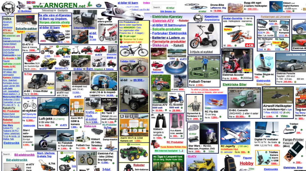
This is a provider called Arngren, (arngren.net)is kind of like a digital vomit. It’s got bits and pieces everywhere on the page, and it’s really, really difficult to understand what the page is about. The only kind of clue is the little kind strapline at the top of the page called “Technology and gadgets.” You can get a gist of what it’s about, but it fails on several points and it doesn’t really tell you anything. The user will likely arrive and click away because they will be too confused to know what you want them to do next.
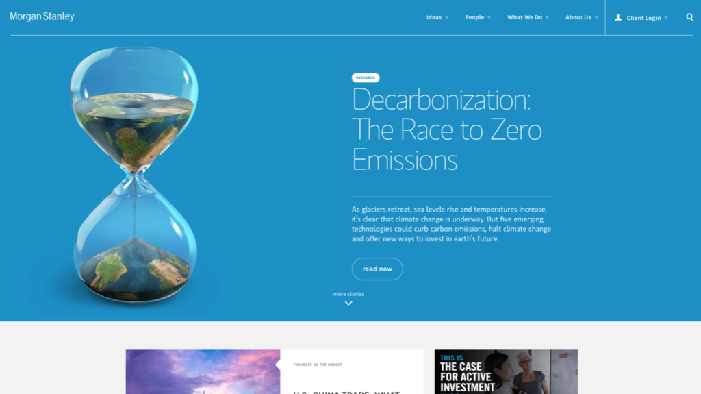
A page I was really surprised by was the Morgan Stanley website. They didn’t really have a value proposition at all. If I didn’t know who Morgan Stanley was, why would I want to buy from them? The only thing that I could find on their homepage was information about climate change and de-carbonization, the race to zero emissions, which I thought was really peculiar and not related to what they do.
A financial services website that I’ve come across is in the UK is a website from a provider called NatWest, which is one of the big four banks. Their value proposition is ‘how can we help you today?’ If I didn’t know who NatWest was or what they provide, why would I hang around? Always try and assess your website in the eyes of your customers and ask “What’s in it for me”, and “why is this particularly relevant?” There was no connection to me, so I would have left and checked out a competitor.
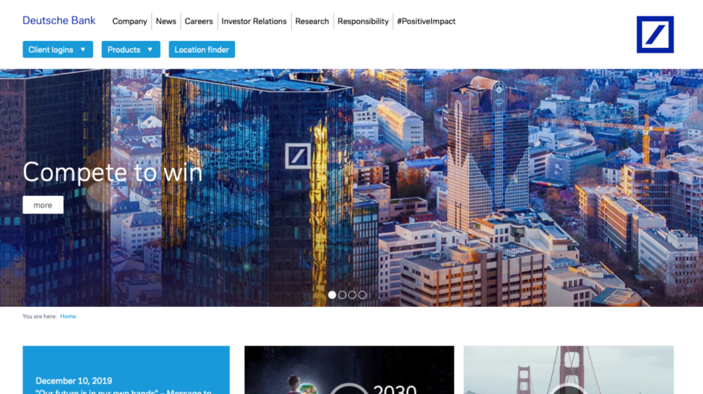
Another really bad offer example from a financial services website is Deutsche Bank. Their value proposition is “Compete to win.” Does that provide you with any particular value? Does it tell you where I am, what I can get here? Does it tell you why I should buy from you? It might explains why Deutsche Bank is having issues at the moment.
In the next article, I’ll show you some good value propositions and some examples of how they work so you can do a like-for-like comparison.
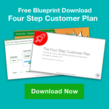
If you’d like to find out how to audit your homepage get it here.