Select Page

Customer Personas or avatars


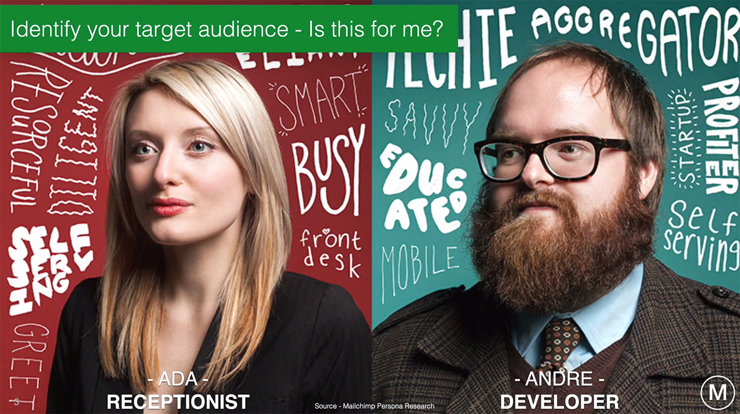
Whenever we design a digital product or service, we need to identify who our target audience is at the customer level. Finding outmore about them and understanding key pain points will mean that we can design a product or service exactly as they need it. This is a principle know as customer centred design.

A tried and tested way of starting the process is to create what are known as ‘Customer Personas’ or ‘Avatars’. These providea representation of the different user types and form a useful point of reference that you can use to develop all aspects of your proposition, from design to marketing messaging.

One type of user persona is going to have a different requirement to another and, depending on their attitudes, motivations, behaviours, pains, gains, we need to design our propositionaround what it is that they actually need at the time.

There’s a concept called moment of orientation, sometimes called ‘moo’.


Whenever someone arrives at a landing page, they have a number of question marks in their head that need answering, and it’s your job as a marketer to eliminate them.

They’re going to question things like, Where am I? What do you want me to do next? Where did they put this thing? Why have they called it that?If we can go through that list of question marks and tick them all off, then they will be much more likely to buy from you.

Whenever prospects have these question marks, it creates confusion and something called cognitive load,redicing the likelihood of them buying or completing a desired action.

In order to avoid these issues we take advantage of things like conventions, accepted ways of doing or designing pages. You should break pages into different areas so that people can scan content and make it really obvious what’s clickable and what isn’t.

Becoming laser targeted on what our end customer avatar wants will give you a quality outcome.

I would recommend you speak to your prospective customers using either telephone or face to face research. We do lots of customer interviews as want to understand in much more depth, what actually makes that customer tick. They have their own mental models, or perceptions of what something looks like or how something should behave based on their past experiences. Ifyou had never used an iPad before, your mental model of reading a book on an iPad will be different to someone that uses it regularly.


It is really important that when you do your customer research that you understand how users think, and how their different mental models that they have in their head, will affect how they use that product or service.

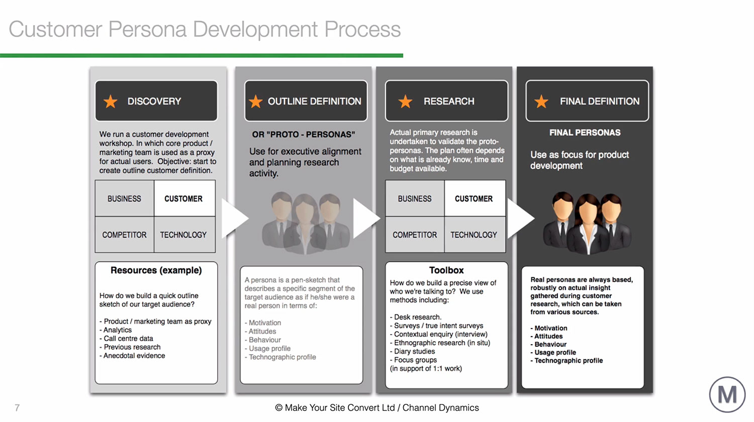
When undertaking customer research, you will want to understand everything from website analytics right through tocall centre data and read any previous research.We can sometimes turn that into something called asketch persona, a proto persona.

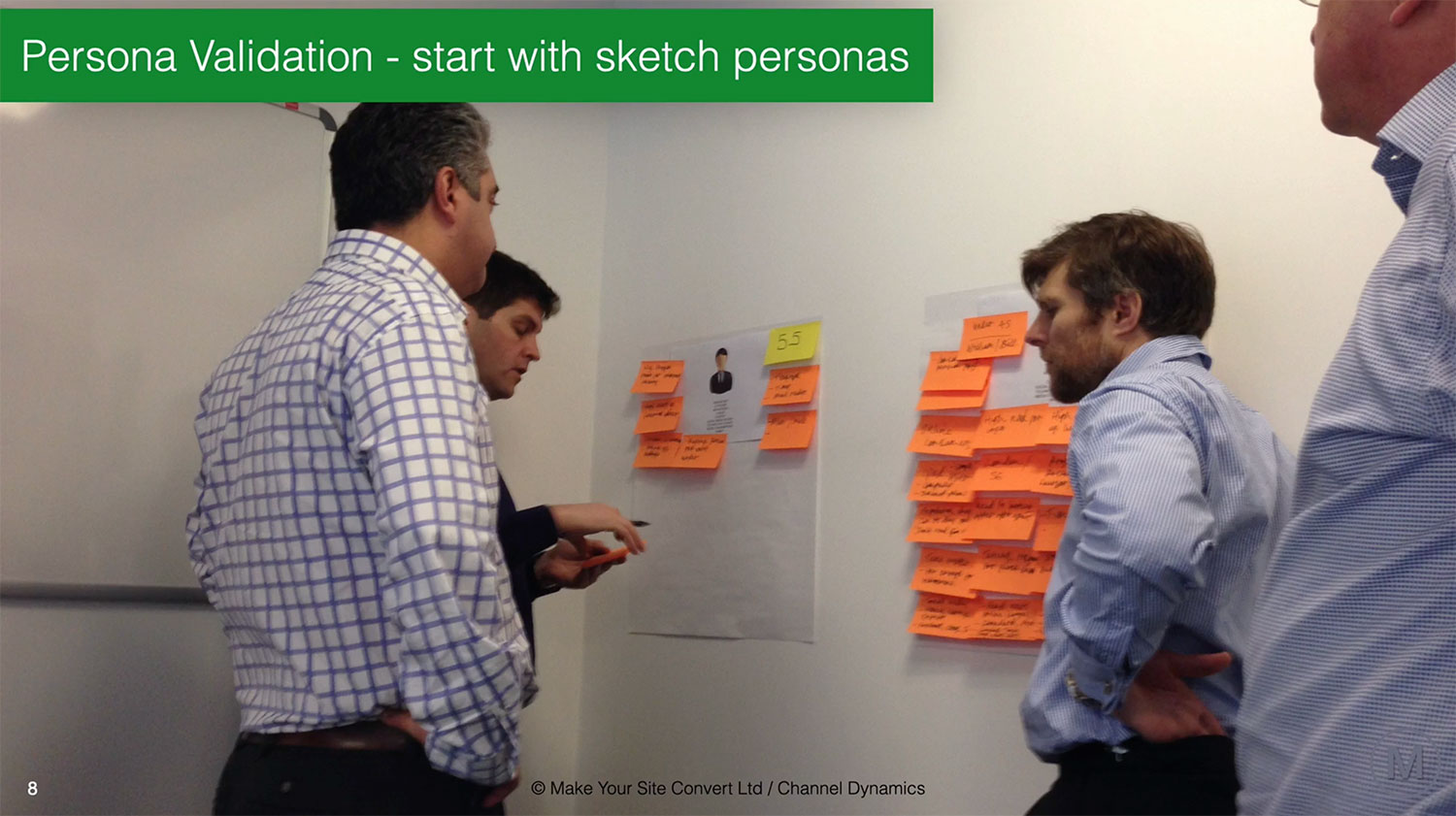
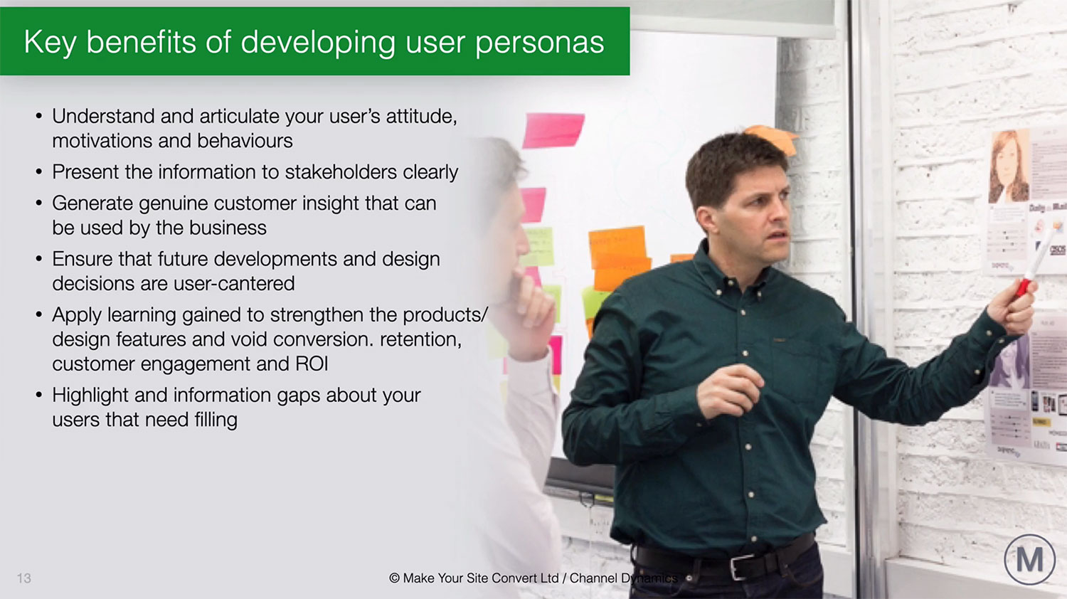
If you don’t already have much research, the sketch persona is a really good starting point for some further primary research. You can get expert stakeholders together from the organisation that know a lot about the product or service and use this as a way of defining who to speak to next.Many clients that I have dealt with, tend not to have a great deal of background customer research sogetting all of that useful information out ofstakeholders’ heads is essential.

Running this process as a quick workshop is the best way of efficiently getting everything you need. Use any room and put some giant post it notes on the wall with a new point created on each new note to build out your avatar or persona.

You could do this in your home office or virtually via a zoom call and tools like Miro enable you to run the same workshop online in an interactive way using their digital whiteboards.

If you have more budget, the best way of getting into customers’ heads is doing one on one research.

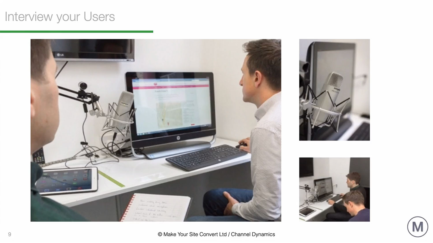
One to one research enables you to take customers through specific user journeys, and you can probe them, askingfor more information about their motivations for doing things.

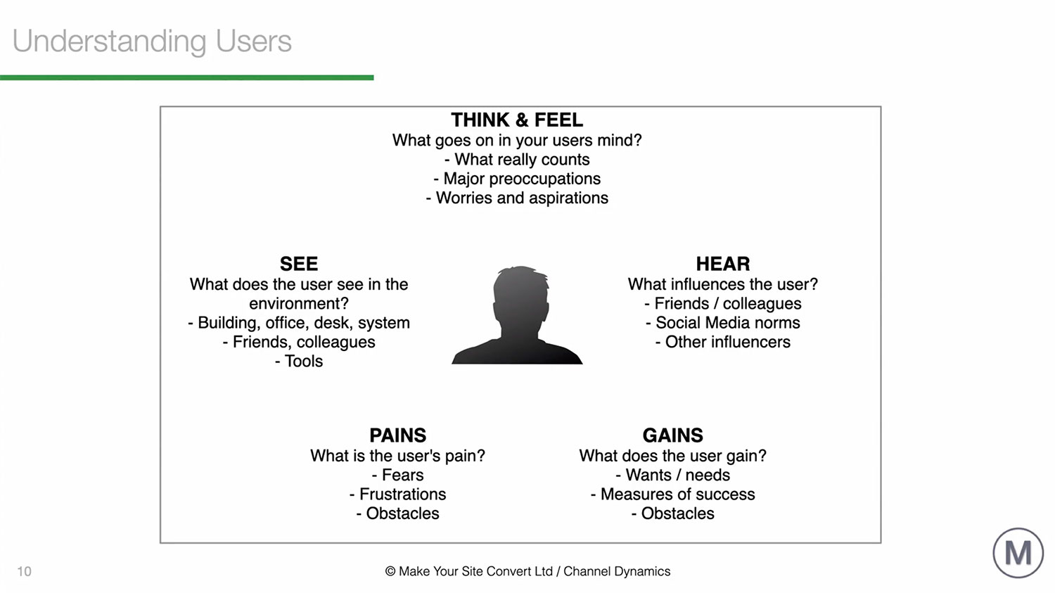
You will want to understand attitudes, motivations, behaviours, the pains and frustrations that the avatar have, so you can get under the skin of that customer.

Whenever you’re designing your product, service or your training course, it is essential to design it around the needs of those users.

Your customer persona a really useful one-page summary of who your end customer is. I often print the avatars out as an A3 page and put them on the wall and use them as a point of reference for whenever I’m thinking about the digital products or services that I’m designing or developing.

It’s useful to add a picture and give the persona a name.Think about the age range that they might be and bring them to life.

Finally, you will be able to identify further research you need to find out about your customers.You can present your information to other stakeholders and generate genuine customer insight that you can use in different parts of your business. When you’re making design decisions, they are going to be user centred.

Good Offer or Value Proposition Examples (Part 2 of 2)

As a second part to this series about offers or value propositions, I want to run through some good examples. The first one that’s definitely worth a look at is Stripe, and if you remember, we have to answer the questions: “Where am I?”, “What can I get here?” and “Why should I buy from this particular website over a competitor?”


The new standard in online payment as pretty clear it tells me what they’re providing. Stripe is the best software platform for running an internet business. We handle billions of dollars every year for forward thinking businesses around the world. So that’s pretty clear. It tells me what they do, and they come across as being very trustworthy because they’re dealing with billions of dollars every year. So I like that one and I think it’s demonstrating the benefit that you’ll get from using this service.


The next example is a UK insurance website Legal & General. People are really buying a future state when they buy your offer. As a result of buying your digital product or service, I (the user) will arrive at my preferred future state, which is a better version of myself.


The message is “Save for fun days, not just rainy days. Learn how to invest with confidence.” I really like this clear proposition of what I’m going to get. I know it’s all about saving and financial services. So that’s nice and clear and I can see a nice jolly picture of a father and son that represents where I might be going in life. It’s a really well crafted offer and message.


Slack is a messaging service. The offer is “Slack replaces email inside the company, keep conversations organized in Slack, the smart alternative to email”. It says what it does. They replace email inside your company. As a result of using this service, I don’t need to use as much email and can keep the conversations to a minimum. We all have full inboxes don’t we? I like the value proposition and I’m in their target market of users.


The next example, Crazy Egg is one of my favourites out of all of the value propositions that I’m demonstrating in this article. They are a web tool provider. Their value proposition is “Make your website better instantly.” That’s pretty interesting if you have a website, isn’t it? The sub-headline is “Over 300,000 websites use Crazy Egg to improve what’s working, fix what isn’t and test new ideas.” It is very clear what the offer is and what it will do for me. I’m interested.


That confirmation of trust is reiterated. 300,000 websites use Crazy Egg. Wow, that’s pretty impressive. “What do I need to do next?” “What can I get here?” The call to action is to put my URL in the box and it’s going to show me what to do instantly and then start my 30 day free trial, which I can cancel anytime. This is is a super example and crafting a clear offer is one of the hardest things to do in marketing, but a great offer will sell without you having to sell.


Crazy Egg also use imagery in a quite a clever way. Someone dangling from a hot air balloon and one of the people there is pointing at the value proposition. The woman has binoculars in the line of sight all subtly pointing to the value proposition. It’s done in a really clever way and great thought has been given to the design as it follows the key principles that many miss when designing pages. The calls to action on the page are simple and uncluttered. Keep it simple and ask for one main thing on your page. I really like Crazy Egg as an example of how to design an offer in a simple but very clear way.

The final one in this article is Uber. The interesting thing about this Uber page is that it’s designed in an F pattern. People in the west read from left to right, so it follows this F pattern structure that is tried and tested to deliver results. The value proposition is “Get in the driver’s seat and get paid.” “Drive on the largest network of active users.” So it ticks all the boxes. It tells me what I can get here.


Why should I buy from them over a competitor? The largest network of active riders says that they’re the biggest and as a result I’m going to trust them. It implies that there will be lots of work for me too so it makes me want to I sign up to drive. Also, the person on the picture is smiling. It’s always good to have a picture of a person on a landing page if you can and a happy one even better. Show me the future state that I will get by using your service. He looks like he might be an Uber driver, which is a good use of their target avatar or persona. I will run through this in some more detail in future articles.


If you’d like to find out what the other nine homepage errors are and how you can fix them, we have a 10 point homepage audit tool. If you click on the link below, you can download this template and the accompanying video and you can use it to audit your existing homepage. It will show you step-by-step how to find what’s wrong with your homepage and you’ll learn how to fix them.


It’s a tool that I use with my high ticket consultancy clients. It works really well. Within a matter of minutes, you can go through and pick off some of the main things that are probably causing your home pages not to convert as well as they could.

So click on the following link and you will get instant access to the download. In the next article we’ll discover more about funnels and conversions.

The No.1 Reason For Low Website Conversions – Bad VP (Pt 1 of 2)

Are you making this one fatal homepage error? You wouldn’t be alone, because about 90% of businesses that I’ve come across seem to. I see hundreds of homepages doing this one particular thing really, really badly. So getting it right is vital if you have any type of homepage or a landing page. You to keep the customer’s attention and get more conversions.

The biggest, most important conversion factor is the offer (known as the value proposition). I’m going to just tell you a little bit about why it’s vitally important to get it right.

All conversion rate optimization, or CRO, is based on two things, cost and value. If you are a business, you will need to present the customer, your user, with a particular offer. The promise of value that’s going to be delivered is called the value proposition. So it’s the main reason the prospect should buy from you and the benefits they can expect to receive in exchange. You can capture all of this information in your headline and sub-headline.

There’s a concept called ‘Moment of Orientation’, or MOO for short. You only have a few seconds to get your information across to your users. So you’ve got to basically communicate really quickly. If you’ve got a poor value proposition, it can lead to high bounce rates. Obviously, if you’ve got a really good value proposition, it’s going to improve your conversion rate significantly.

You have to answer three questions from the user. Where am I? What can I get here? And why should I buy from you (as a particular provider over your competitor)? The value proposition explains how the product and service solves the users’ problems. The paracetamol for their pain. It tells the customer about the benefits they can expect and why they should buy from you. It’s not a slogan, it’s not a positioning statement. The thinking behind a good offer is really quite a detailed process.

Let’s have a look at a few bad value propositions to demonstrate not what to do.

This is a provider called Arngren, (arngren.net)is kind of like a digital vomit. It’s got bits and pieces everywhere on the page, and it’s really, really difficult to understand what the page is about. The only kind of clue is the little kind strapline at the top of the page called “Technology and gadgets.” You can get a gist of what it’s about, but it fails on several points and it doesn’t really tell you anything. The user will likely arrive and click away because they will be too confused to know what you want them to do next.


A page I was really surprised by was the Morgan Stanley website. They didn’t really have a value proposition at all. If I didn’t know who Morgan Stanley was, why would I want to buy from them? The only thing that I could find on their homepage was information about climate change and de-carbonization, the race to zero emissions, which I thought was really peculiar and not related to what they do.


A financial services website that I’ve come across is in the UK is a website from a provider called NatWest, which is one of the big four banks. Their value proposition is ‘how can we help you today?’ If I didn’t know who NatWest was or what they provide, why would I hang around? Always try and assess your website in the eyes of your customers and ask “What’s in it for me”, and “why is this particularly relevant?” There was no connection to me, so I would have left and checked out a competitor.

Another really bad offer example from a financial services website is Deutsche Bank. Their value proposition is “Compete to win.” Does that provide you with any particular value? Does it tell you where I am, what I can get here? Does it tell you why I should buy from you? It might explains why Deutsche Bank is having issues at the moment.


In the next article, I’ll show you some good value propositions and some examples of how they work so you can do a like-for-like comparison.

If you’d like to find out how to audit your homepage get it here.