Good Offer or Value Proposition Examples (Part 2 of 2)
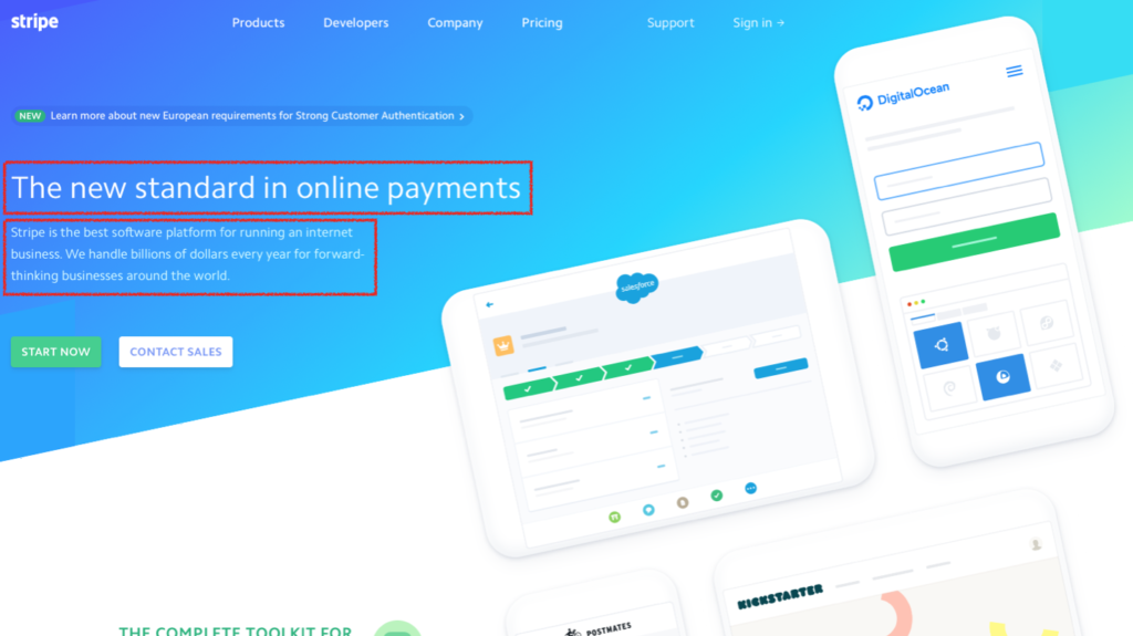
As a second part to this series about offers or value propositions, I want to run through some good examples. The first one that’s definitely worth a look at is Stripe, and if you remember, we have to answer the questions: “Where am I?”, “What can I get here?” and “Why should I buy from this particular website over a competitor?”
The new standard in online payment as pretty clear it tells me what they’re providing. Stripe is the best software platform for running an internet business. We handle billions of dollars every year for forward thinking businesses around the world. So that’s pretty clear. It tells me what they do, and they come across as being very trustworthy because they’re dealing with billions of dollars every year. So I like that one and I think it’s demonstrating the benefit that you’ll get from using this service.
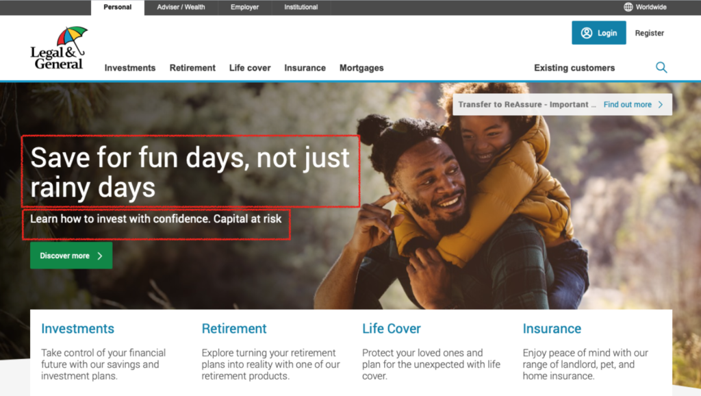
The next example is a UK insurance website Legal & General. People are really buying a future state when they buy your offer. As a result of buying your digital product or service, I (the user) will arrive at my preferred future state, which is a better version of myself.
The message is “Save for fun days, not just rainy days. Learn how to invest with confidence.” I really like this clear proposition of what I’m going to get. I know it’s all about saving and financial services. So that’s nice and clear and I can see a nice jolly picture of a father and son that represents where I might be going in life. It’s a really well crafted offer and message.
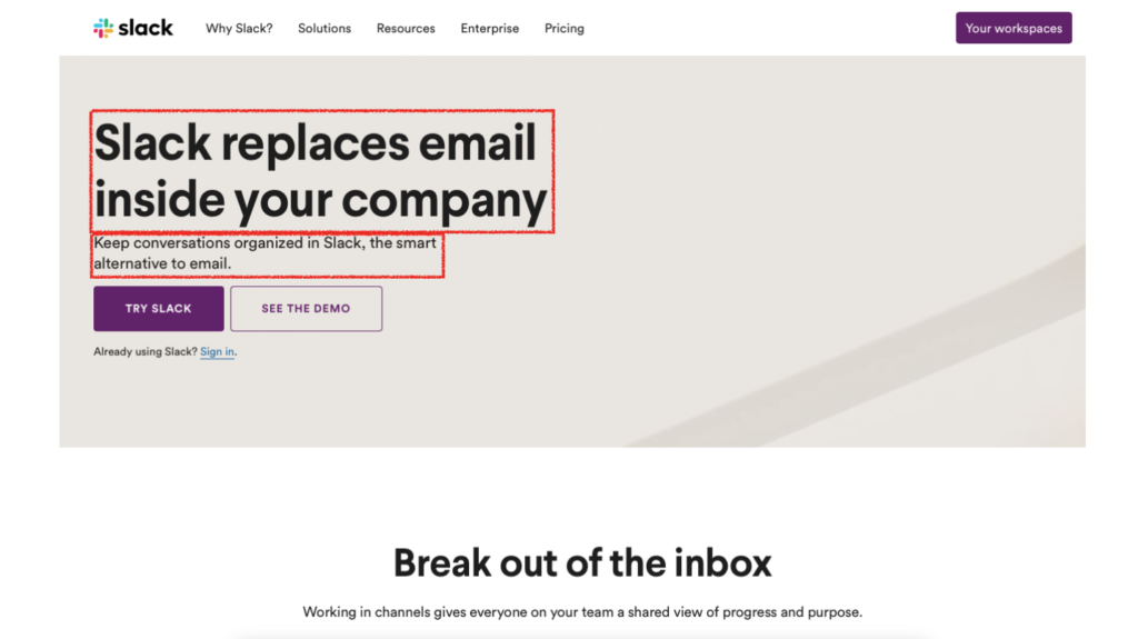
Slack is a messaging service. The offer is “Slack replaces email inside the company, keep conversations organized in Slack, the smart alternative to email”. It says what it does. They replace email inside your company. As a result of using this service, I don’t need to use as much email and can keep the conversations to a minimum. We all have full inboxes don’t we? I like the value proposition and I’m in their target market of users.
The next example, Crazy Egg is one of my favourites out of all of the value propositions that I’m demonstrating in this article. They are a web tool provider. Their value proposition is “Make your website better instantly.” That’s pretty interesting if you have a website, isn’t it? The sub-headline is “Over 300,000 websites use Crazy Egg to improve what’s working, fix what isn’t and test new ideas.” It is very clear what the offer is and what it will do for me. I’m interested.
That confirmation of trust is reiterated. 300,000 websites use Crazy Egg. Wow, that’s pretty impressive. “What do I need to do next?” “What can I get here?” The call to action is to put my URL in the box and it’s going to show me what to do instantly and then start my 30 day free trial, which I can cancel anytime. This is is a super example and crafting a clear offer is one of the hardest things to do in marketing, but a great offer will sell without you having to sell.
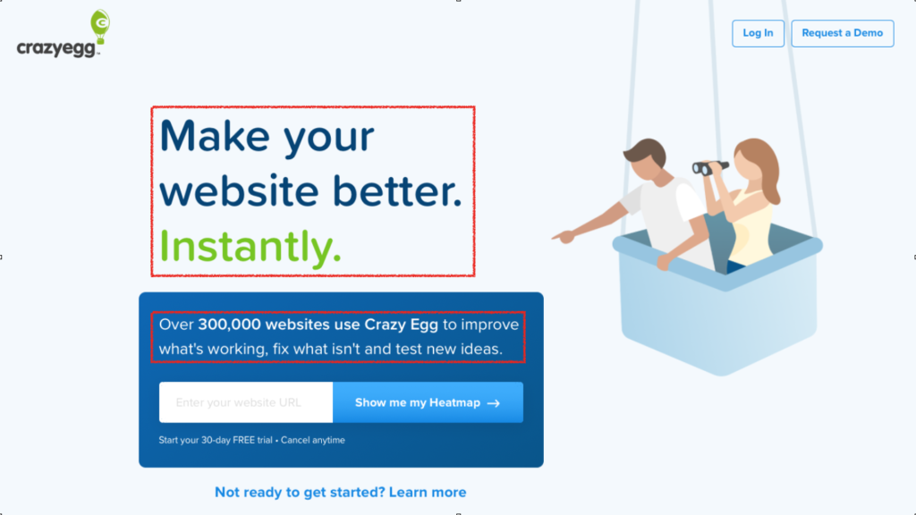
Crazy Egg also use imagery in a quite a clever way. Someone dangling from a hot air balloon and one of the people there is pointing at the value proposition. The woman has binoculars in the line of sight all subtly pointing to the value proposition. It’s done in a really clever way and great thought has been given to the design as it follows the key principles that many miss when designing pages. The calls to action on the page are simple and uncluttered. Keep it simple and ask for one main thing on your page. I really like Crazy Egg as an example of how to design an offer in a simple but very clear way.
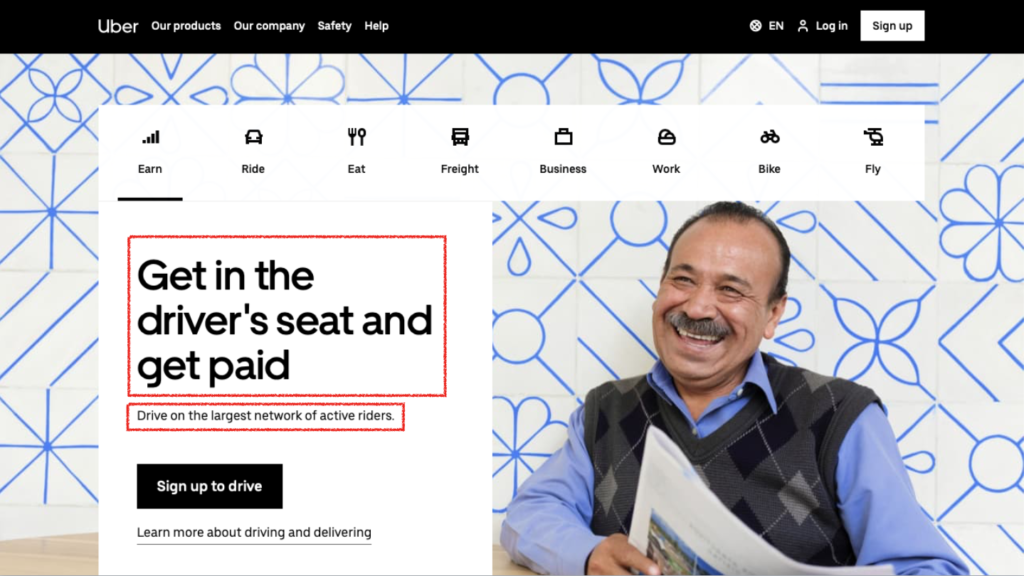
The final one in this article is Uber. The interesting thing about this Uber page is that it’s designed in an F pattern. People in the west read from left to right, so it follows this F pattern structure that is tried and tested to deliver results. The value proposition is “Get in the driver’s seat and get paid.” “Drive on the largest network of active users.” So it ticks all the boxes. It tells me what I can get here.
Why should I buy from them over a competitor? The largest network of active riders says that they’re the biggest and as a result I’m going to trust them. It implies that there will be lots of work for me too so it makes me want to I sign up to drive. Also, the person on the picture is smiling. It’s always good to have a picture of a person on a landing page if you can and a happy one even better. Show me the future state that I will get by using your service. He looks like he might be an Uber driver, which is a good use of their target avatar or persona. I will run through this in some more detail in future articles.
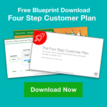
If you’d like to find out what the other nine homepage errors are and how you can fix them, we have a 10 point homepage audit tool. If you click on the link below, you can download this template and the accompanying video and you can use it to audit your existing homepage. It will show you step-by-step how to find what’s wrong with your homepage and you’ll learn how to fix them.
It’s a tool that I use with my high ticket consultancy clients. It works really well. Within a matter of minutes, you can go through and pick off some of the main things that are probably causing your home pages not to convert as well as they could.
So click on the following link and you will get instant access to the download. In the next article we’ll discover more about funnels and conversions.
As a second part to this series about offers or value propositions, I want to run through some good examples. The first one that’s definitely worth a look at is Stripe, and if you remember, we have to answer the questions: “Where am I?”, “What can I get here?” and “Why should I buy from this particular website over a competitor?”
The new standard in online payment as pretty clear it tells me what they’re providing. Stripe is the best software platform for running an internet business. We handle billions of dollars every year for forward thinking businesses around the world. So that’s pretty clear. It tells me what they do, and they come across as being very trustworthy because they’re dealing with billions of dollars every year. So I like that one and I think it’s demonstrating the benefit that you’ll get from using this service.
The next example is a UK insurance website Legal & General. People are really buying a future state when they buy your offer. As a result of buying your digital product or service, I (the user) will arrive at my preferred future state, which is a better version of myself.
The message is “Save for fun days, not just rainy days. Learn how to invest with confidence.” I really like this clear proposition of what I’m going to get. I know it’s all about saving and financial services. So that’s nice and clear and I can see a nice jolly picture of a father and son that represents where I might be going in life. It’s a really well crafted offer and message.
Slack is a messaging service. The offer is “Slack replaces email inside the company, keep conversations organized in Slack, the smart alternative to email”. It says what it does. They replace email inside your company. As a result of using this service, I don’t need to use as much email and can keep the conversations to a minimum. We all have full inboxes don’t we? I like the value proposition and I’m in their target market of users.
The next example, Crazy Egg is one of my favourites out of all of the value propositions that I’m demonstrating in this article. They are a web tool provider. Their value proposition is “Make your website better instantly.” That’s pretty interesting if you have a website, isn’t it? The sub-headline is “Over 300,000 websites use Crazy Egg to improve what’s working, fix what isn’t and test new ideas.” It is very clear what the offer is and what it will do for me. I’m interested.
That confirmation of trust is reiterated. 300,000 websites use Crazy Egg. Wow, that’s pretty impressive. “What do I need to do next?” “What can I get here?” The call to action is to put my URL in the box and it’s going to show me what to do instantly and then start my 30 day free trial, which I can cancel anytime. This is is a super example and crafting a clear offer is one of the hardest things to do in marketing, but a great offer will sell without you having to sell.
Crazy Egg also use imagery in a quite a clever way. Someone dangling from a hot air balloon and one of the people there is pointing at the value proposition. The woman has binoculars in the line of sight all subtly pointing to the value proposition. It’s done in a really clever way and great thought has been given to the design as it follows the key principles that many miss when designing pages. The calls to action on the page are simple and uncluttered. Keep it simple and ask for one main thing on your page. I really like Crazy Egg as an example of how to design an offer in a simple but very clear way.
The final one in this article is Uber. The interesting thing about this Uber page is that it’s designed in an F pattern. People in the west read from left to right, so it follows this F pattern structure that is tried and tested to deliver results. The value proposition is “Get in the driver’s seat and get paid.” “Drive on the largest network of active users.” So it ticks all the boxes. It tells me what I can get here.
Why should I buy from them over a competitor? The largest network of active riders says that they’re the biggest and as a result I’m going to trust them. It implies that there will be lots of work for me too so it makes me want to I sign up to drive. Also, the person on the picture is smiling. It’s always good to have a picture of a person on a landing page if you can and a happy one even better. Show me the future state that I will get by using your service. He looks like he might be an Uber driver, which is a good use of their target avatar or persona. I will run through this in some more detail in future articles.
If you’d like to find out what the other nine homepage errors are and how you can fix them, we have a 10 point homepage audit tool. If you click on the link below, you can download this template and the accompanying video and you can use it to audit your existing homepage. It will show you step-by-step how to find what’s wrong with your homepage and you’ll learn how to fix them.
It’s a tool that I use with my high ticket consultancy clients. It works really well. Within a matter of minutes, you can go through and pick off some of the main things that are probably causing your home pages not to convert as well as they could.
So click on the following link and you will get instant access to the download. In the next article we’ll discover more about funnels and conversions.